Showing posts with label Rachel Pollock. Show all posts

Friday, December 4, 2015

Creating a Starcatching Color Palette for Peter

Rachel Pollock at work
"A show like Peter and the Starcatcher has an incredibly specific color palette, which means that we moved a lot of projects through the dye shop for this production," says costume craftsperson Rachel Pollock.

Rachel was painter/dyer for the individual parts of each of the many costumes worn by thirteen actors portraying over 100 characters, while her co-craftsperson, third year graduate student Erin Abbenante, made many of the hats and headdresses. Together they served as a craftwork team of two, coordinating with the main costume shop team, comprised of many more costumers (both staff and students),  working as tailors, drapers, stitchers and more. 

In addition to handling yards and yards of fabric, this included work with vintage lace trim, buttons and elastic for suspenders. Mermaid costumes for one show-stopping production number alone required over thirty dye jobs for everything from zippers to satin gloves.

The brocade vest for  pirate chief Black Stache embellished with applique dragon motif and hand painted designs. And to the right, as worn by Mitchell Jarvis playing the dastardly dandy (photo by Jon Gardiner.)
The Ensemble struts their stuff  as musical mermaids. (Photo by Curtis Brown.)
The collar for warrior chieftain Fighting Prawn, ornamented with rooster tail feathers and hand-painted cutlery. And as worn by Myles Bullock (center front) with the Ensemble. (Photo by Curtis Brown),

"When you look at the array of clothes for this show, an incredible amount of labor has gone into creating the effects the audience enjoy during the course of this fast-paced 2-hour performance. Even someone paying close attention to the biggest, showiest costumes will have little idea of the time, effort and attention to detail required," says Rachel.

Enjoy the many colors of Peter and the Starcatcher. Onstage now through December 12.

Click here or call our Box Office 919-962-7529 for tickets.

Friday, March 6, 2015

Patrick Holt's Brilliant Renderings and Costume Concepts Come to Life

Patrick Holt is renowned for his stunning, detailed costume renderings, as pictured below. His costume designs for An Enemy of the People encapsulate the 1950s era of fedoras, tailored suits, and feminine, pastel skirts. Limited to the subdued colors worn by business men of the 1950s, Patrick's palette was more muted, but one character needed to stand out.

Patrick's inspiration behind Peter Stockmann's flair, as worn by Anthony Newfield. Photo by Jon Gardiner.
Peter Stockmann, the Mayor, needed to exude a certain importance, explains Rachel Pollock, costume craftsperson. She said the design team received an email from director Tom Quaintance stating, "The Mayor's hat needs to clearly be the Mayor's hat." She and Patrick jumped into action, finding exactly the right details to complete Peter's ensemble. They searched for a way to ensure Peter would stand out, but it had to be subtle. "We needed some way to set it apart him an official capacity that wouldn't be cartoonish or absurd," said Rachel. Patrick and Rachel chose from a collection of unique feather ornaments to make Peter's costume flourish. This subtle detail proves effective, along with the touch of red, to evoke a sense of authority, wealth, and importance in Peter Stockmann's character.

The concept of water is prevalent throughout the plot, as well as the design concepts. The designs for dresses worn in the second act by Petra and Catherine Stockmann use teals and dim browns evoking the polluted springs that drive the plot, Rachel explained.
"It's a visual representation of the taint in the water."
With water being a common theme throughout the play, it's no wonder Patrick was inspired to create visual representations of the contaminated spring in his designs for the Stockmann women.
Patrick's rendering for Catherine Stockmann as worn by Julia Gibson. Photo by Jon Gardiner.
Patrick's rendering for Petra Stockmann as worn by Allison Altman. Photo by Curtis Brown.
For the angry mob scene in which Dr. Stockmann is pelted with water, precautions had to be taken. Rachel says they spent time Scotch Guarding the costumes they expected to be exposed to the most moisture. However, this was not Rachel's first time working around water in a production. After the 4,500 gallon pool used in PlayMakers' 2014 production of Metamorphoses, she had more than enough skill and experience to collaborate on the challenge of costumes getting soaked throughout the show.

The mob throwing water at the face of Dr. Stockmann. Photo by Jon Gardiner.


We are pleased to have Patrick Holt's costume designs featured in another production at PlayMakers. He served as costume craftsperson for PlayMakers early on in his career. Rachel said Patrick's past experience with PlayMakers simplified the process for the collaborative costume team. "He ran this dye shop. So he is very familiar with this facility and what it can do."

Patrick's rendering of Dr. Stockmann's costume worn by Michael Bryan French. Photo by Curtis Brown.

See Patrick Holt's beautiful renderings come to life onstage. Book your tickets for An Enemy of the People - onstage through March 15!

Click here to buy tickets or for more info or call our box office at 919.962.7529.

Tuesday, November 18, 2014

Vegetation Creation for the Witch in "Into the Woods": Part 2

By Rachel E. Pollock, Costume Crafts Artisan, PlayMakers Repertory Company

Today I'm talking about vegetation, part two! Recall from my last post that we're working on Into the Woods, and that our Witch's first look is quite vegetable-covered, which has meant a lot of fascinating craft projects for me and my two colleagues on Team Witch, Denise Chukhina and Sam Kate Toney.


For reference, the design rendering by designer Bill Brewer. Note the beans and the fiddleheads on her!

Here's a close-up research image of the type of fern we're trying to replicate for the costume.


Sam Kate took millinery wire and various silk flowers which might be made to look like the fiddlehead. She zigged the wire down the center of the leaves...


...and then spiraled them up! Each fiddlehead has a triangular wire base so that we can stitch it to the gown and control its orientation with respect to the silhouette of the costume.

And here's our pile of magic beans! These are just segments of Mardi Gras parade throws, merrowed up into bits of synthetic fabric and blasted with a heat gun to shrivel them up all natural-looking.


To hear more from Rachel, check out her blog labricoleuse.livejournal.com

Come see Into the Woods and A Midsummer Night's Dream at PlayMakers thru December 7. For tickets, call 919.962.PLAY (7529) or visit our website.

Friday, November 14, 2014

Vegetation Creation for the Witch in "Into the Woods": Part 1

By Rachel E. Pollock, Costume Crafts Artisan, PlayMakers Repertory Company
Rachel E. Pollock

We're currently in production on our repertory shows this year, Into the Woods and Midsummer Night's Dream. Today, I've got a behind-the-scene peek into one of the many cool special effects we're doing in the costume crafts world to create these two huge, magical shows.

Our costume designer for Into the Woods is Bill Brewer, of UNC-School of the Arts. I've been aware of Bill's work for years and met him many times at conferences and symposia, but we'd never worked together. Really excited to have the chance on this great show!

For his concept of the Witch's first costume, he envisioned a dress covered with actual vegetation from her garden, in which Jack's magic beans grow.


Costume design rendering by Bill Brewer

See those cabbages and twigs? That's what today's entry is about! Basically, we're casting them in latex.


Here you see draper and craftsperson Denise Dietrich working on casts of several leaves. Our makeup designer, Caitlin Molloy, cast three actual leaves for us--a collard and two cabbages! We tint the liquid latex with acrylic paints, brush it into the molds in layers. We put in a layer of tulle for stability between coats 3 and 4, and when we peel them out, they look like real vegetable leaves! Then Denise can place them on the garment.


A collard cast ready for demolding. See the rectangle of white tulle in it?


We're also making the twiggy trim along her skirt hem from latex. We paint it out in layers onto these ceramic tiles, then roll it up around strips of muslin into sticklike forms like you see above.

Pretty cool, eh?


To hear more from Rachel, check out her blog labricoleuse.livejournal.com


Come see Into the Woods and A Midsummer Night's Dream at PlayMakers thru December 7. For tickets, call 919.962.PLAY (7529) or visit our website.

Wednesday, February 5, 2014

Behind the Scenes: Hand painting fabric in the costume shop

Rachel Pollock, Costume Crafts Artisan for PlayMakers Repertory Company, and her assistant Katie Keener, hand painted the fabric used to create the glamorous biased cut evening dress worn by Julie Fishell, who plays Amanda in PlayMakers’ production of Noel Coward’s classic Private Lives.

To learn more about the painting process, check out Rachel’s online journal, http://labricoleuse.livejournal.com/.

Here is a video of Rachel and Katie working on the fabric.


Tuesday, April 2, 2013

From an Idea to Execution


Remember when Rachel Pollock walked us through how they custom-printed fabric for Cabaret? Here's the idea fully realized! Go here if you missed the original post to see the full story behind the fabric!

Final dress is tonight! All of Jennifer Caprio's designs will be on full display! Previews start tomorrow. Get your tickets now! They're going really fast!

Monday, March 11, 2013

Printing Custom Fabrics


 By Rachel Pollock, Costume Crafts Artisan

One of the first Cabaret projects we began working on in the costume shop was figuring out how to create some of the fabrics themselves. Our costume designer, Jen Caprio, created some costume renderings which depicted several highly specific fabrics with prints we knew we would not be able to purchase. 

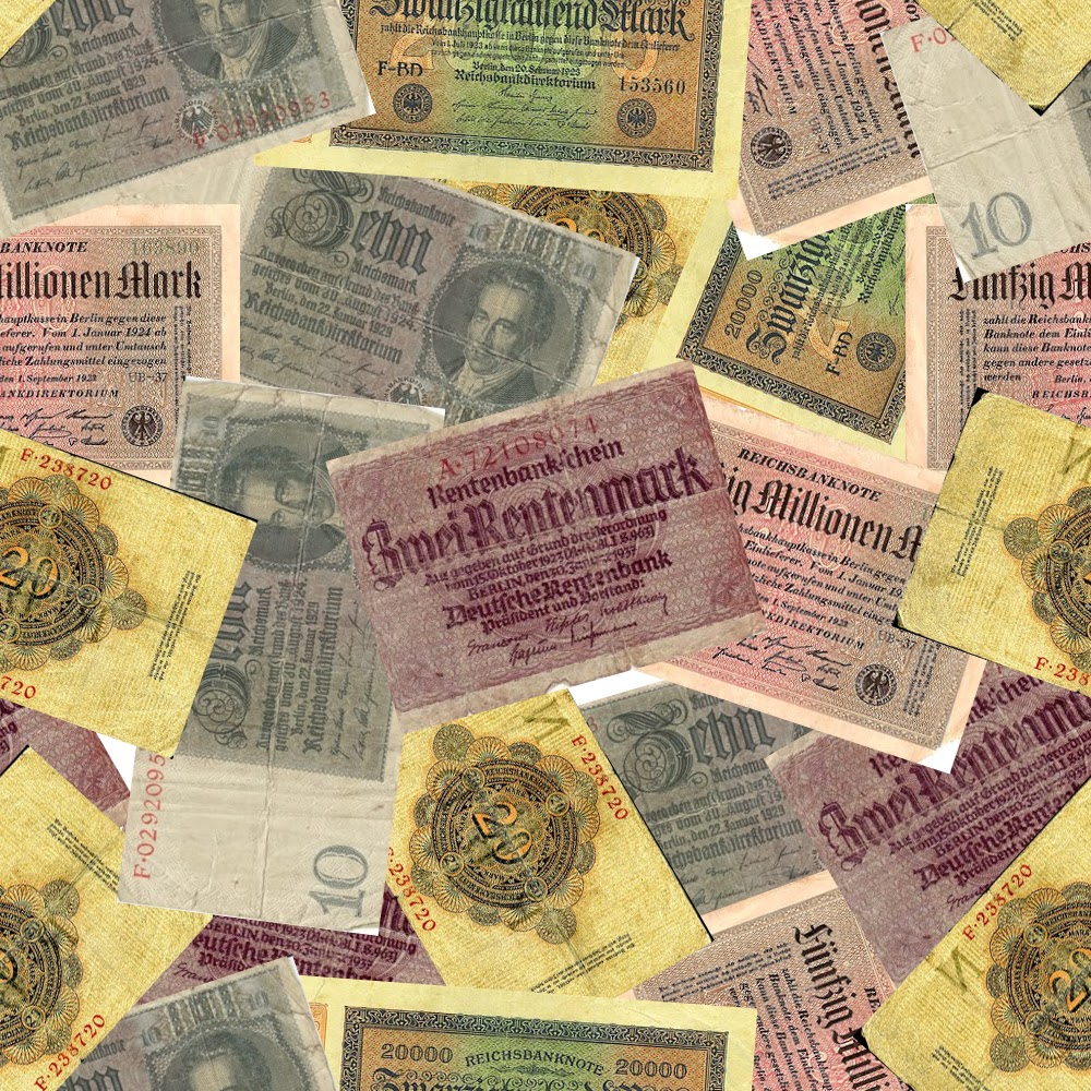
For the “Money” number, the Kit Kat Girls and the Emcee have costumes made from matching fabrics, covered with images of the vastly devalued Deutschmarks. Paper money had become so worthless at the time, that there were bills in circulation at denominations like the 20,000DM note and the 5,000,000DM note.  Jen provided us with an array of images of this money, and we set to work. 

Crafts Artisan Candy McClernan is heading up the surface design effects on this show, and she created a digital textile print design of a seamless repeat using the scattered Deutschmarks. Her print art looks like this:

Then we used local custom fabric printers Spoonflower to order yardage of the fabric for the costumes—silk for the women’s skirts and sturdy cotton twill for the Emcee’s jodhpurs. You can see the fabric online at Spoonflower here.


For one of Sally’s dresses, Jen found a wonderful research image of a woman wearing a dress made in a fabric printed with giant zeppelins. Candy used a combination of digital manipulation and drawing by hand to create a printable version of the zeppelin artwork, and again we used Spoonflower’s digital fabric printing technology to make the fabric for this outstanding dress.

 Of course, we began all of this several weeks before the actors arrived since in order to digitally print fabric you have to allow extra time for the production of it, unlike fabric you can impulse-buy from a store like Mulberry Silks. The fabrics arrived the day after the actors did, so our drapers in the costume shop would have everything they needed to begin work on the patterning and sewing of the costumes!

Friday, December 14, 2012

Get There Faster: Our Pair of Visiting Actors Talks About IT'S A WONDERFUL LIFE

Todd Lawson and Katja Hill in
It's a Wonderful Life: A Live Radio Play

Returning to PlayMakers to play the role of Lana Sherwood in It's a Wonderful Life: A Live Radio Play has been both a pleasure and a challenge. It's Monday, our day off from the run, and it's startling how exhausted I am. With our busy schedule of eight shows this last week, resulting in two double-show days fraught with twice the amount of time wrangling elaborate victory rolls on my heavily gelled and ossified hair, the joy of acting has shown its flip side as quite a bit of hard work. It's impossible to do each show well without sufficient rest in between.

It may have something to do with the nature of the show itself. Frank Capra's famous film is episodic, with a seeming cast of thousands popping up in multiple locations that zoom in and out in quick succession. It's also longer than the runtime of our play, adapted by Joe Landry. Translating this vivid world to a single unit set of a theater -- with a shorter run time to tell the tale -- takes a great leap of imagination and careful choices. Our director Nelson Eusebio accomplished this task with a small cast of five actors, one foley artist, and a shrewd economy of staging with tireless attention to what is perhaps the least glamourous element of playmaking outside of the sheer slogging work of learning lines: those infernal transitions!


What's a transition? Well, that means any change from scene to scene. On any given page in Landry's script, we could be in the radio studio, heaven, Martini's bar, Nick's bar, the Building & Loan, 320 Sycamore, mean old Potter's office, Zuzu's bedroom, or half a dozen other places. And despite the beauty and careful detail of McKay Coble's art deco set, Burke Brown's magical lights, and Rachel Pollock's elegant, beautifully tailored costumes, we don't use much other than four chairs, a few microphone stands, and Mark Lewis's savvy sound effects to establish those worlds. The changes from moment to moment are very much actor-driven and therefore, subject to human error. And for a while there, it was usually mine. The success of it all depends on a nimble cast to zip through what our director calls "the tops and tails" of every scene. Without Capra's camera to direct the eye, any one of us could shake an audience's focus, attention and interest in a poorly wrought scene change. Staying ahead of the audience is vital, though extremely difficult with such a well-known holiday classic tale. 

For my part, the name of the game is always "Get There Faster!" In heels, no less. So much of playmaking comes down to utterly mechanical stuff that would bore most folks to tears if they had to sit through a cue-to-cue tech rehearsal.  No, it isn't sexy, but those matters present actors with countless opportunities to kill a show with their bare hands if they're not ready to pounce on the transitions. It's odd how this awareness has changed what I've learned to see as an audience member. The best directors are those who are able to be fleet-footed in the changes from scene to scene so that the show can literally get out of its own way, but few want to spend precious rehearsal time thinking such things through. Our audiences are fortunate that Nelson did. 

Katja Hill


Todd Lawson as George Bailey (center),
with Maren Searle as Mary and Brandon Garegnani as Clarence.

Hey there folks,

So I traveled down to PlayMakers Rep from Brooklyn, New York, on a chilly October day, not really knowing what to expect. I couldn't have asked for more. What a welcoming company and community.  The experience here has been amazing. I was thrilled to be able to play one of my favorite characters of all time, George Bailey. But, to then be surrounded by such talented and generous souls while doing it has been the icing on the cake. It truly is A Wonderful Life here in Chapel Hill, North Carolina. If you haven't gotten a chance to come see the play yet, I hope you come share my joy for this wonderful story in this wonderful place during this wonderful holiday season. Thanks PlayMakers and Chapel Hill.  Hope to see ya again soon.

Todd Lawson


IT'S A WONDERFUL LIFE: A LIVE RADIO PLAY adapted by Joe Landry
November 28 – December 16, 2012
Directed by Nelson T. Eusebio III
JUST THREE PERFORMANCES LEFT!


Wednesday, December 5, 2012

IT'S A WONDERFUL LIFE: Dressing the Players within the Play, Part III

As PlayMakers puts the finishing touches on it's on-stage reinvention of the holiday film classic IT'S A WONDERFUL LIFE, we go behind-the-scenes to see what inspired our creative team, beyond Capra's classic movie, of course.

We continue our look at the sources that inspired costume designer Rachel Pollock when creating the clothing for the two '40s-era actors tackling the iconic roles of George Bailey and Mary Hatch.


Perhaps unsurprisingly, Rachel looked to Jimmy Stewart for our own lovable George, Jake Laurents (played by Todd Lawson). Also included are some close studies of texture and neckties, as well as specific focus on getting exactly the right, scene-stealing hat.

Sally Applewhite (Maren Searle) plays Mary Hatch, and color is among the orders of the day. Rachel looked at many examples of stylish 1940s cuts and catalogues to come up with just the right tone for our clever lady from Bedford Falls.


IT'S A WONDERFUL LIFE: A LIVE RADIO PLAY adapted by Joe Landry
November 28 – December 16, 2012
Directed by Nelson T. Eusebio III
SECURE YOUR SEATS NOW

Wednesday, November 28, 2012

IT'S A WONDERFUL LIFE: Dressing the Players within the Play, Part II


As PlayMakers puts the finishing touches on it's on-stage reinvention of the holiday film classic IT'S A WONDERFUL LIFE, we go behind-the-scenes to see what inspired our creative team, beyond Capra's classic movie, of course.

We continue with a look at the sources that inspired costume designer Rachel Pollock.

Lana Sherwood (played by Katja Hill) is sometimes sweet, sometimes seductive actress behind the voice of Violet. Rachel turned to '40s-era advertising to come up with a look suitable for a woman on the move.

And like all good '40s radio productions, we need a foley artist, the man behind the hundreds of noises and sounds that bring a radio production to life. Like Freddie Filmore, our foley's wardrobe aspires to Cary Grant, but not without a certain touch of the man behind the curtain.

IT'S A WONDERFUL LIFE: A LIVE RADIO PLAY adapted by Joe Landry
November 28 – December 16, 2012
Directed by Nelson T. Eusebio III
SECURE YOUR SEATS NOW

Monday, November 26, 2012

IT'S A WONDERFUL LIFE: Dressing the Players within the Play, Part I

As PlayMakers puts the finishing touches on it's on-stage reinvention of the holiday film classic IT'S A WONDERFUL LIFE, we go behind-the-scenes to see what inspired our creative team, beyond Capra's classic movie, of course.

For starters, the script is set in a 1940s radio studio on Christmas Eve, as five radio actors transport a live audience both to Bedford Falls and into this timeless story of family and redemption. Those five wartime actors have personalities and stories themselves, distinct and sometimes quite different from the familiar characters from the original movie: George, Mary, Clarence, Violet and more. PlayMakers costume designer Rachel Pollock went back to the '40s to come up with the clothes that make these players-within-the-play. Here, in the first of three segments to be posted this week, we look at the sources that inspired Rachel in coming up with the distinct, on-stage look for each character, as well as read her notes on these idea-generators.

Freddie Filmore (played by PlayMakers veteran Ray Dooley) is the boisterous radio announcer who takes on the role of the villainous Mr. Potter. No surprise that Rachel sought out the look of A-listers Cary Grant and Clark Gable--fittingly grouped with the height of 1940s tailoring--for this commanding personality.

Funnyman Harry "Jazzbo" Heywood (Brandon Garegnani) plays the beloved if somewhat bumbling guardian angel Clarence. He does so in a wardrobe inspired by jazz standout Dizzy Gillespie, with a sharp tie, loud jacket and perhaps larger-than-necessary pants.


IT'S A WONDERFUL LIFE: A LIVE RADIO PLAY adapted by Joe Landry
November 28 – December 16, 2012
Directed by Nelson T. Eusebio III
SECURE YOUR SEATS NOW

Monday, February 13, 2012

"Behind the Grime" by Rachel Pollock

by Rachel Pollock, Crafts Artisan

My favorite project on Henry IV is far and away the aging process for Falstaff's fiddleback leather coat, which was custom made for actor Michael Winters in the role. We brought on board tailor Kara Monroe (also a UNC alum from our costume production MFA program) to pattern and construct the coat from three hides of lovely buttery leather. (It had to be big to go over Mr. Winters' prodigious fat padding suit!)

Kara made a beautiful garment, but a just-made coat looks like exactly that: a new piece of clothes! Falstaff is not the sort of man who has a brand new anything in this play, unless it's maybe a brand new bottle of booze. Costume Designer Jennifer Caprio had very clear ideas about the nature of the coat--my notes from our discussion about the aging say:
  • his favorite coat
  • worn it for 30 years in battle/war/bar brawls
  • lays around brothels in it
  • drinks all night in it, passes out in it

Photobucket
Costume design rendering by Jennifer Caprio
 
Photobucket
Michael Winters as Falstaff in a fitting for the coat.
 
I tell my students that the nature of the aging process is twofold. There's breakdown, which might be as simple as laundering a new shirt with washing soda or might be as extensive as ripping a ragged hem or tearing holes in knees/elbows. And, there's pigment age, which might be dipping white shirt in a pot of tea or might be splattering it with paint or ink or dye. For the Falstaff coat, I did very little breakdown, only using a fine grit sandpaper on some of the flat-fell seams and across the tops of the shoulders, just to soften the leather and rough up the surface a tad. The majority of work involved pigment aging--in this case, application of leather dyes and French Enamel Varnish.

French Enamel Varnish, more commonly called FEV in our industry, is a medium that you mix yourself according to your needs. Its components are leather dye, denatured alcohol, and shellac, and your project determines the ratio. If you need something runny, use a minimal amount of shellac; if you need something thick, use a lot of shellac and not much alcohol. Use more dye for more pigmentation, less for lighter hues. Use gloves when you work with it and only apply it in a well-ventilated area. I cut on the big wall vents in my dye shop and, thanks to the mild winter, even opened the windows.

Photobucket
Application of FEV on interior of Falstaff coat.
 
I applied this treatment in four layers, and unfortunately it went fast enough and I was busy enough I only have the one process shot laying on the table. But I can tell you about it! First, I used a dauber to apply tan leather dye to all the seams on the coat. Kara and Jen had put a lot of thought into the construction of this coat and I wanted to highlight that fiddleback seam placement, and the number of gores in the frock. The tan leather dye served to pump up the eye's perception of those seams onstage.

Next, I used a toothbrush to flick the tan dye and some medium brown leather dye up from the hem like residual stains from ancient mud splatters, and also to drip it down from above (like drunk-guy spillage and rain-stain from some bad weather on an age-old battlefield) onto the lapels and chest. I also used a chip brush with the two kinds of leather dye and two related colors of FEV to paint a sort of ombre effect from the hem up, to create some sweat stains in the armpits and around the collar, and to do some allover dry-brush toning.

Photobucket
Front view on form.
 
Photobucket
Rear view on form.
 
Photobucket
Stage shot of ensemble by Jon Gardiner with Michael Winters as Falstaff in foreground.
 
Hope you enjoyed seeing "behind the grime," and if you are in the Triangle area, definitely check out these two plays. They are, quite literally, epic.

- - - - - - - - - -
The Making of a King: Henry IV & Henry V is now playing through March 4. Click here for more information and tickets.

Wednesday, January 18, 2012

Altering Armor for The Making of a King

by Rachel Pollock, Crafts Artisan

On deck at work, we are currently well into production on a pair of repertory shows, Shakespeare's Henry IV and V. The designs for this show are one of those non-era-eras that I like to describe as "postmodern collage"—a mixture of modern and historical styles all blended together to create intriguing looks not tied to any specific time, leather jerkins with jeans and workboots and that type of thing.
I like working on shows done in that way for contemporary audiences because it allows for all the super cool craft stuff that Shakespeare histories pretty much need (like armor!), but it also makes those things accessible to the modern eye in an empathetic way that true period pieces from about the 17th century back don't. It is very hard, in the 21st century visual milieu, to look like an indomitable, ruthless soldier in, say, pumpkin hose and tights.

Our designer, Jen Caprio, is renting and purchasing the armor because there is just SO much of it needed. If we were doing one of these plays, I could have built some, but both in repertory with the bulk of the rehearsal period happening over our winter vacation, that meant too little time and not enough staff to plan the making of any of the big pieces. Instead, one of the biggest responsibilities I have is to make the armor we've rented fit the actors we've cast, without altering it in any permanent way, yet maintain the standard of quality that I expect.
One of the things I stress in my classes is that there is the best way to do something, and everything else is a concession you ought to choose to make. In a classroom context, I teach what I believe to be the best way of doing things, since it is easier to make informed concessions required by things like a lack of time/money/labor than it is to break bad habits of shoddy workmanship. It is exciting to see all these pieces of armor from all different sources and makers, and look at the choices they have made in construction (some of which are helpful and others leave me scratching my head). Today I am going to write about how we reversibly altered a piece of leather armor for our productions in such a way as to maintain its level of quality inside and out.

Photobucket
 Woven leather jerkin from OSF Costume Rentals
 
Photobucket
Shoulder seam detail. I see some grommets I need to replace. Note elements like the integrated D-ring for clipping a gorget to.
 
Photobucket
What's going on with this side-seam's double lacing?
 
Photobucket
...it's hiding a quick-change closure in there!
 
This is the piece in question. It's made from strips of leather woven together and riveted at all the crossovers. The edges are bound with a rollover leather strip binding, and the two halves lace together at the shoulders and sides. It has also been aged and toned with paint and dye effects. We have rented it from the Oregon Shakespeare Festival's costume rental division.
Among regional theatres, the OSF is a powerhouse when it comes to quality armor production. Their pieces are made to withstand not only their own productions' run, but built to last for many shows and rentals thereafter. They make it policy to cut no corners, and their work is categorically levels of awesome: is it great, or is it spectacular? The artisans turning out their pieces know their work can't just be crap that looks decent enough from the front row and can cling on for a two-week run, and it's a pleasure to work on their stuff. OSF costumes are made with longevity and quality at the forefront, because they become assets in the rental side of the company.

So, if it's so great and all, what could we possibly need to do to this thing? Well, the design concept does not include any skirtlike hangdowns. We need to use it, but lose the long tabs along the bottom. Obviously, we're not going to make that happen with scissors and rivets.

For the fittings, to insure that it would work for one of our actors, I had my assistant Whitney use masking tape with a light-tack adhesive to just tape the tabs up inside. The light-tack adhesive would keep them out of the designer's sightlines for the fitting, without damaging or removing any of that great paint treatment. Tape was fine at this point, because why go to the trouble of a more professional finish if it wasn't going to fit any of our actors? So, tape-tape-tape, and off it goes to be fit.

A couple days later, it comes back. Yay, we love it on somebody, so we're using it! Now's the time to figure out something better than tape, because any tape that will hold up to over a month worth of repertory shows with fight choreography is going to damage the piece, which is not only Not Okay in my own personal book, it's Way Not Okay in our rental contract.


Photobucket
Inside of the front with the tabs folded up in the desired style.
 
What will I do? I can't and wouldn't ever cut those tabs off or duct-tape them up. If it were ours, I might consider popping some of the rivets and replacing them with Chicago screws (like a rivet, but with a threaded shaft so they're removable) so I could hold the tabs up that way, but I’m not popping whole rows of rivets on a piece that's not ours.

Photobucket
I took a measure of the area blocked out in black in the image above, for both front and back.
 
I use clips and clamps when I need to hold pieces of leatherwork together, not anything puncturing like pins or tacks.
 
I cut a rectangle for each from a section of black vinyl, doubled back an inch on each end for the lacing sections, then had Whitney punch holes to correspond with the holes in the sides of the garment itself. Above the vinyl insert is clipped to mark the holes for punching. Each vinyl insert is labeled to note whether it's front or back, since they're different sizes, just in case wardrobe needs to remove them at any point.


Photobucket
Crafts assistant Whitney Vaughan shows how she's tacking up the tabs.
 
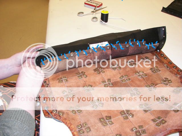
See those strips at the base of each tab at the back, to reinforce the rivets? Those are only riveted on, not glued also, which meant that Whitney was able to use a heavy carpet thread and slide a needle between them, and whipstitch the tabs to the vinyl insert without ever puncturing any of the leather. Here, the blue lines show a vague diagram of how that stitching runs, for a visual:

Photobucket

Next, she laced the inserts into the armor, thus:


Photobucket
We put Velcro on the insert since it would cover the strip on the armor itself, to maintain the quick-change closure option.
 
Photobucket
Ta-da! Lookout, Hotspur! Prince Hal is ready for you!
 
So, there's one of many armory projects that are moving through my shop these days. I've got another couple in-progress, so once those move onto the Done Rack, I’ll give you the skinny on them as well.